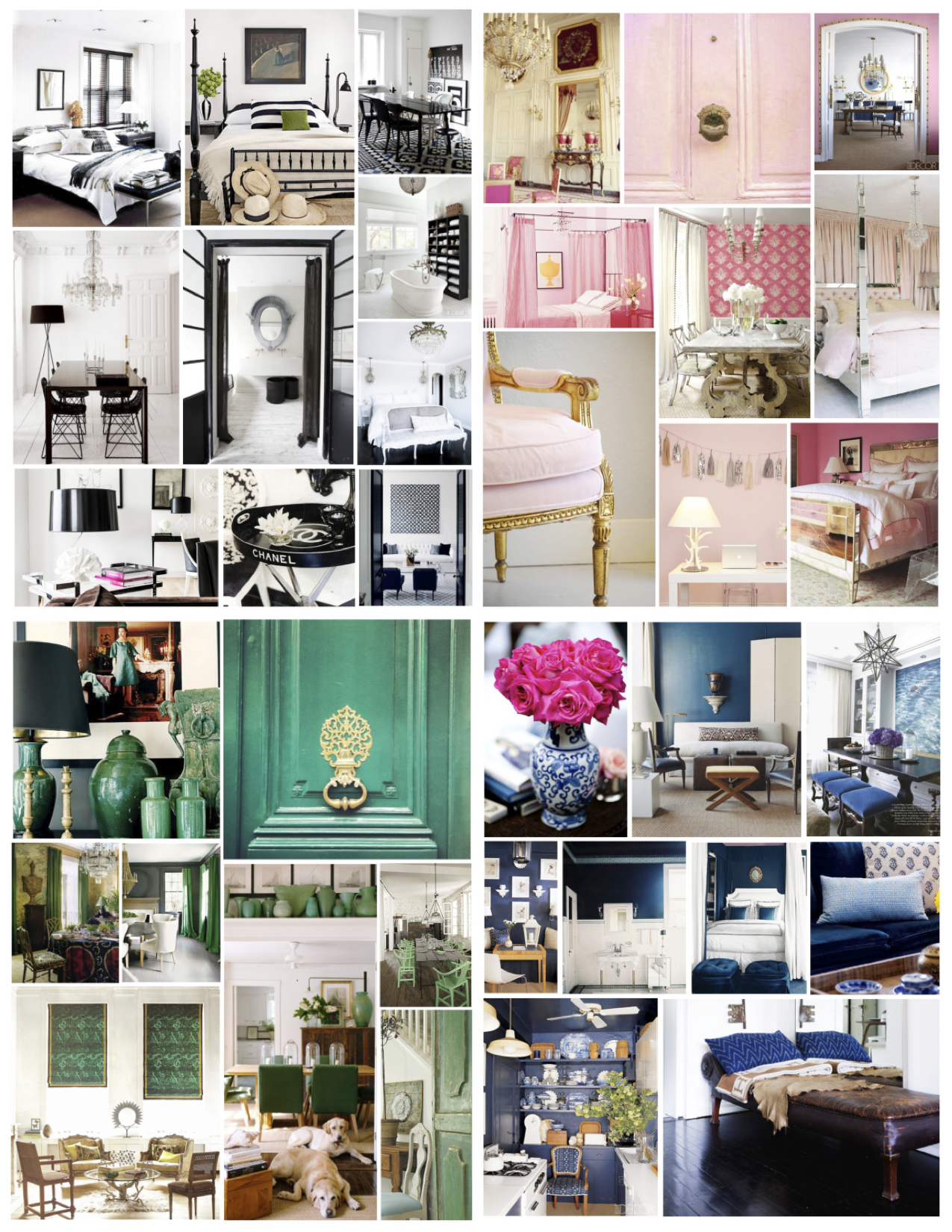
Blushed. A word that references an unexpected pink rosiness to the cheeks in delightful response, so, too, does the infusion of pink fill interior spaces with unexpected delight. Blushed in pink. And can the color be layered in a modern, sophisticated appeal? Indeed it can. There is elegance in a color that nature paints its blooms. Perhaps with appreciation, this compilation of hues of blushed pink tones will showcase the timelessness of a color. With modern appeal, for certain…
Hues Of Blushed PinkInterior Inspirations: Pink InfusionsLayered In PinkBlushed Pink Hues In The Interior WorldBlushed In Interior StyleInfusion of Color: Pink Hues In The InteriorBlushed: Kissed With A Touch Of Pink
As Winter’s barren effects and pure white snow surrounds, perhaps there is no month more appropriate than February to present a visual of blushed pink hues. A burst of pale color seems the perfect infusion.
Consider in appreciation the addition of pink to the world of interior spaces. Seasonless in style with perhaps a boldness even in its faded form. Pink is not for the timid yet its hue in our modern world of design offers an elegance of classic beauty with a modern edge. I’ll blush to that.
Golden Appeal. Perhaps there is something very striking of the color of gold as a New Year begins. Brilliance. Yet another recurring focus upon golden hues within the interior (January 2013, Visions Of Gold). Yet the “gilded” appeal within the interior is striking at any time of the year. Timeless. Gold seems to offer a timeless richness. Perhaps the hue that has historically symbolized wealth and power offers more than a bold impact of rich visual appeal within the interior. An elegant appeal in a hue of gold that endures, indeed.
The term “Gilded” in terms of interiors is something “covered thinly with gold leaf or gold paint”. An overlay with a thin covering of gold Highlights that stands out in striking appeal. The term “Golden” is termed as “made of relating to gold”. As for the color of Gold or golden, it is a color of “one of a variety of yellow-orange color blends used to give the impression of the color of the element gold”. Elements of gold. Of note, the American Heritage Dictionary defines the color metallic gold as “A light olive-brown to dark yellow, or a moderate, strong to vivid yellow”. Whether vibrant or muted, metallic or swathed in a fabric accent, painted on the walls or statement objects of gilded impact, the color of gold within the interior offers vivid & bright intensity . Whether you refer to these shiny hues of interior brilliance as “Gilded” or “Golden” or simply a hue of “Gold”, the mere broad appeal of the color of gold within our interiors deserves our focus once again…
Interiors Of Gilded & Golden AppealStriking Gold Accents Within The InteriorInterior Delights: Hues Of GoldInterior Delights: Hues Of GoldInterior Goldtone Visuals of DelightGolden Appeal Within The InteriorGolden Visuals Of Interior StyleDark Pairing Of Vibrance: Golden Hues“Golden” Interior AppealGold Reflections: Interior Inspirations Of Golden HueGolden Hues Of Brilliance Within The InteriorBrilliance Of Gold Within The InteriorGilded & Golden Interior AppealGold tones Of Impact
Consider the brilliance and striking visual of hues of gold and gilded delight within interior spaces. Certain to be appreciated as a timeless and classic hue of visual interest, the gilded appeal that graces interior worlds will continue to present a striking impact. Gilded inspiration of hues of golden delight. Stunning elegance and timeless appeal, indeed….
Onward,
Kristin
“Yellow-colored objects appear to be gold” – Aristotle
Myself/Golden Reflections/Charleston, South Carolina/2015
Interior Color Inspirations: January/Striking Black & White, February/Hues Of Pink, March/Brilliant Green, April/Dramatic BlueInterior Color Inspirations: May/Warm Yellow, June/Refreshing Coral, July/Statement Red, August/Tranquil TurquoiseInterior Color Inspirations: September/Subtle Beige, October/Painted Black, November/Muted Gray, December/Crisp White
“A year in color”. A visual journey of color inspirations…
Color is defined as “That aspect of things that is caused by differing qualities of the light reflected or emitted by them, definable in terms of the observer or of the light.” For certain, the world of color is an inspiration of possibilities within our interiors. Choices of tone, mood and statement. An appreciation of hues of color drenching the interior, coating the walls or saturating our spaces is worthy of our focus. Whether you live within the wonder of bold and distinctive hues or muted shades of appealing allure, the choice is certainly yours. Choosing to fill your spaces with colors that bring joy to you and define you and your personal sense of style is paramount. Whether white or vivid and bold red, the choice is personal. Yet an appreciation of all colors is also paramount…
Enjoy the visual reflection of a year of “color” coating interior spaces. And if you desire to linger further, month by month, for more visuals and words of description of these coated hues? Peruse the category “Interior Color Inspirations”. Inspiration may follow…
Cheers to “color” within your interior!
Kristin
“Nature always wears the colors of the spirit”
-Ralph Waldo Emerson
“Colors, like features, follow the changes of the emotions”
-Pablo Picasso
Brilliant white. The shade of Winter that holds seasonless appeal. The color of pure snow on snow capped mountains, white is the color of light and the opposite of its counterpart, black. The classic combination of black and white prevails in enduring style. Yet Modern appeal and elegance certainly results with the injections of any color against the blank canvas of white. The potential to inject seasonal or accent colors always brings an added striking appeal to a space clad in white. Distinction against white, for certain…
Of historical interest, the Icelandic word for white is “Hvitur”, derived from the Old Norse form of the word “Hvitr”. Common Germanic used the word “Blankaz”, meaning “White, bright and blinding”. Like the blinding snowfall on a Wintry day. The Germanic term is said to have been borrowed from the Late Latin term “Blancus”, which meant simply “White”. A clean and pure color. “White as snow”. Perhaps the color represents a visual “Whiteout” within your surrounds. Of additional interest, within Europe and the United States, the color white is said to be associated with not only with perfection, positivity, brilliance, illumination, faith, purity, neutrality and lightness but exactitude. Exactitude. There is an intent when we envelope our spaces in white. A bold, dramatic intent exists within interiors layered in white, for certain…
With layerings from brilliant white and parchment white to cream, the many subtleties of white delight with texture and crisp, refreshing style. Cool, calm and serene yet powerful. Perhaps the beauty of the color white is its versatile range that pairs beautifully with varied styles of interior design. White visually expands a space and emphasizes natural light, showcasing the elements and the furniture in the space that it fills. White provides a backdrop to display one’s personality and style with a color scheme that does not compete but offers a stunning background for distinctive furniture, artwork or other elements that one wishes to command attention. Within the walls of white and rooms filled with objects that meld into the backdrop, tone on tone, the elements of bold style and distinction stand out. Patterns and textures also create depth and interest against a snowy white backdrop. Versatile all year round, awaiting our seasonal injections of interest and allowing focal points to change. Versatile stying, indeed…
Classic Simplicity: Interiors Blanketed In WhiteInterior Distinction: White InteriorsMuted Palettes: Variations Of White InteriorsLayers Of White Variations Within The InteriorWhite Delights: Interiors Coated In WhiteWhite Interiors: Neutral Elegance Of Simplicty
Consider white. An all-white palette perhaps adds a Wintry spin to our spaces. The elegance of this stark, crisp and yet serene color can provide a clear and deliberate focus for our spaces. Ethereal elegance. Classic, sharp and clean. Blanket your spaces and gain fresh clarity with the pure color of white. Whether you view the white interior as coated in a fresh “blanket of white” or a cool retreat and haven within Summer’s heat, the bold layering of a white interior provides a pure and sharp contrast of style. Pure white style, like fresh snow. Classic and crisp “Winter White”, indeed….
Kristin
“…Winter is the snow with black silhouettes…” -Vincent Van Gogh
Shades of gray. A transition between the two colors of black and white, the striking statement of gray seems to envelope our interior spaces. The monochrome, neutral color of “gray” (or “grey”) is perfection in a blend of black and white. Grayscale. As the deeper tones are considered dramatic and mysterious, the lighter tones seem to illuminate with silvery appeal. And of the sophistication and balance that the rich, pewter gray walls and embellishments of gray offer within our interiors? Certainly worthy of a visual appreciation. Perhaps a modern backdrop of restful ambiance, the neutral palette of gray colors provide an unassuming appeal. Understated elegance, in tones of gray, indeed.
Of interest, the first recorded use of the word “Grey” or “Gray” in the English language as a color name was in 700 AD. The traditional spelling of the word “Gray” is “Grey”, which is the British, Canadian, Australian, Irish, New Zealand and South African spelling. However, “Gray” is said to also have been common in the UK until the second half of the 20th century. “Grey” is the accepted variant in American English, but the common and perhaps preferred spelling is “Gray” since its introduction to American English around 1825. That said, having learned as a child to spell the color as “Gray”, it is indeed the spelling I chose. No matter the spelling, the color hue of gray is one of delight…
Gray Waters: The Atlantic Ocean
A sea of gray. Perhaps, for me, it is the personal calm of visual recollections from youth of the gray cast that the bodies of water of the Long Island Sound and the Atlantic Ocean take on upon Winter’s arrival. Having appreciated the changing color tones since youth, these beautiful waters of gray envelope my memories. Soothing recollections. Although the color gray is said to be an unemotional color that is not only neutral but ‘detached’, I disagree with the concept of gray as detached when layered within the realm of the interior. Saturated spaces with beautiful blends of gray are a visual delight that is restful. Interiors wrapped in tones of gray bliss. The beauty that is found in the color gray is certainly a comfortable ‘melding’ of splendid style. Luxurious, like cashmere. An interior saturated and swathed in tones of the soothing, calming and muted gray hues provide enduring visual appeal…
A Muted Palette Of Distinction: Gray InteriorsShades Of Gray: Neutral BlissSubdued Elegance: The Gray Palette Within The InteriorUnassuming Shades Of Gray: Style & EleganceGray Delight: Understated Sophistication
Consider the color gray to imbue your spaces with elegance. A subdued hue of distinctive and recognizable style. Whether a beautiful backdrop against a vivid color or an interior draped completely in gray, the sophistication of the color gray is timeless. Distinguished and classic elegance is found within the diverse hues of gray. Muted palettes with classic appeal, indeed…
The Refreshing Color Of Turqouise Within The Interior
The tranquil color of Turquoise. On the heels of Summer, perhaps there is no other color that seems to equate Summer than Turquoise. Like the color of the Caribbean waters, this bold, compelling yet restful color saturates our visual senses with thoughts that linger at the water’s edge. With its tropical tone that seems to reference the color of beach glass, adding a splash of turquoise into our interiors will certainly add to calm and tranquility within our interior spaces.
The color Turquoise ranges in the color scale between blue and green. A beautiful combination of brilliant blue with a small amount of uplifting yellow yields this delightful hue. Blue-green style, indeed. Of course, one cannot dwell on the beauty of Turquoise without a reference to the turquoise gem and ornamental stone. The word “Turquoise”, which dates from the 16th century is derived from the phrase “Turkish” or “Turkish Stone”, which referred to its arrival to Europe from Turkey. Mined more than 6,000 years ago in the historical Khorasan Province of Iran, this gem stone provides a soothing color that seems to provide balance and calm when found within the interior. The stone that adorned the jewelry of the ancient Egyptians became a stone that Native Indians referred to as a “Fallen sky stone” which garnered the ability to ward off evil and offer health. Who knew? In ancient cultures the stone was also a symbol of wealth and prosperity. For certain, the color Turquoise has maintained is allure as a rich, vibrant and beguiling blue-green hue…
Uplifting Turqouise Bliss Within The InteriorCalm Sophistication: Interiors Of Turquoise HuesDeep Hues Of Invigorating Style: Turquoise Within The Interior
Consider the fresh, crisp and soothing color of Turquoise. With its unique balance of color hue within the color spectrum, whether opaque and pale sky blue hued or bold and brilliant the captivating color of Turquoise holds an allure that can be appreciated by all. The incorporation of different shades, tints and values of the color, from Aquamarine to Teal, provides balance that is pleasing for the eyes and the senses. With the striking energy of the darker hue of Turquoise brings a sophisticated edge to an interior while the muted shades radiate calm and serenity. Balance of style. And of its coastal appeal? For certain, the color seems to represent water and the blissful essence of Summer. Yet the color Turquoise is seasonless when tastefully styled within the interior. For certain, there is a year-round appeal of the tranquil color of Turquoise. Turquoise bliss, indeed….